
Puerto Color
Puerto Color · Hardware store · Eastern Venezuela
We painted the east.
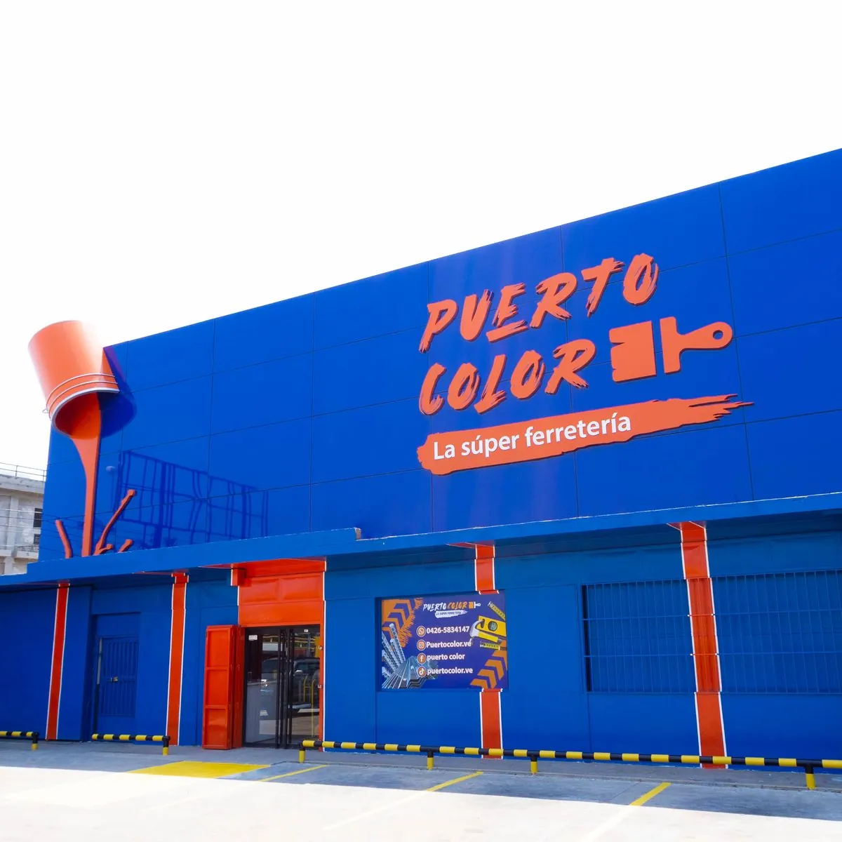
We created the brand for Puerto Color, “La súper ferretería”, and grew with it from one store to five.
Scroll to paint


La súper ferretería

01 — Brand
A logo with a brushstroke.
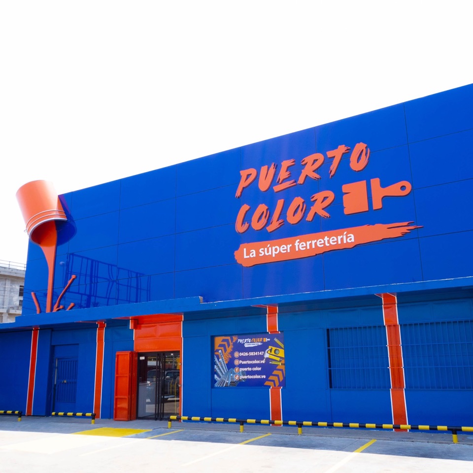
We created the logo and the brand strategy: hand-brushed lettering, a paintbrush as the symbol and two colors, navy and orange, that run from the storefront to the latest post.
#FFFFFFPuerto Color#131245Puerto Color#EE6123Puerto Color02 — Growth
stores
From one store to five.
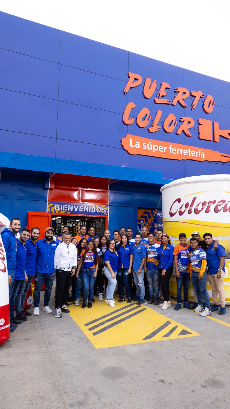
When we started working with Puerto Color it had a single store. Today it has five and is recognized as the hardware leader in eastern Venezuela.
- Store 1
- Store 2
- Store 3
- Store 4
- Store 5
03 — Social and ads
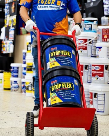
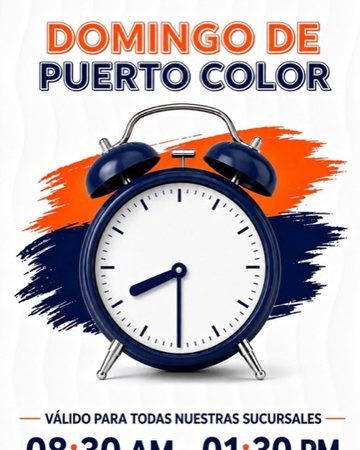
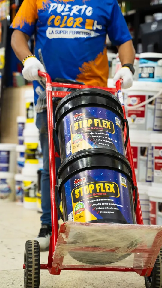
Content made in the store.
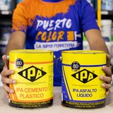
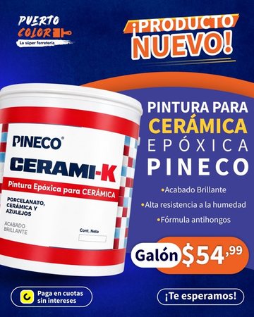
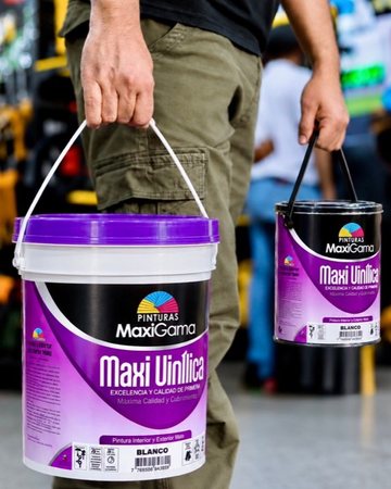
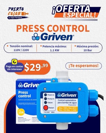
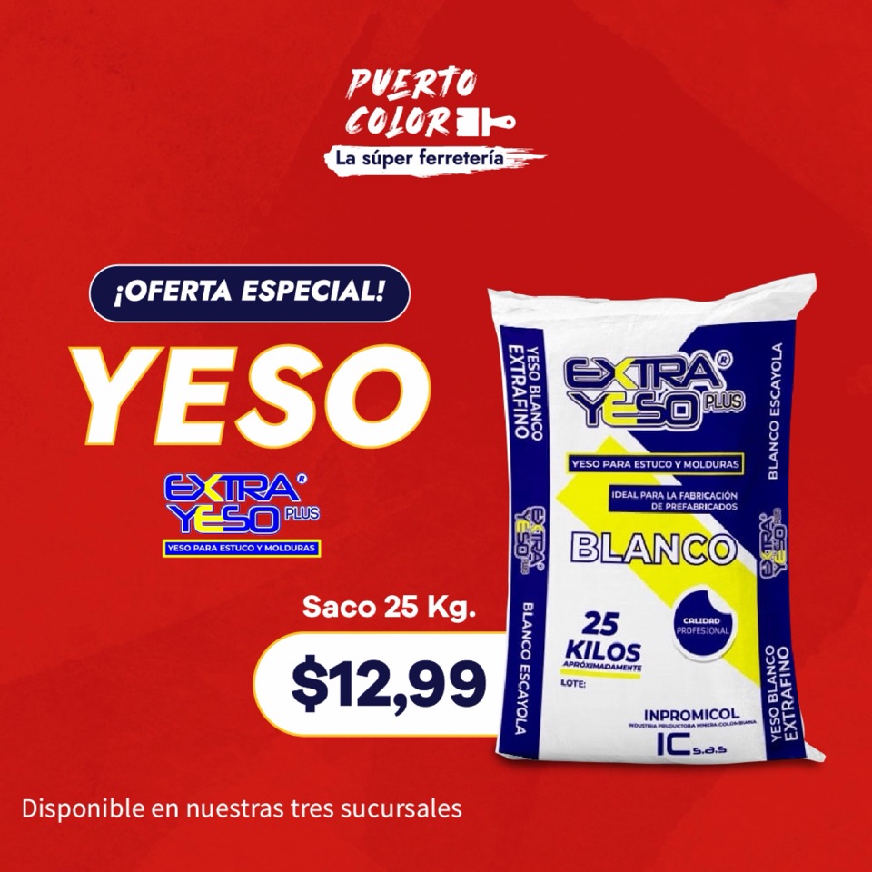
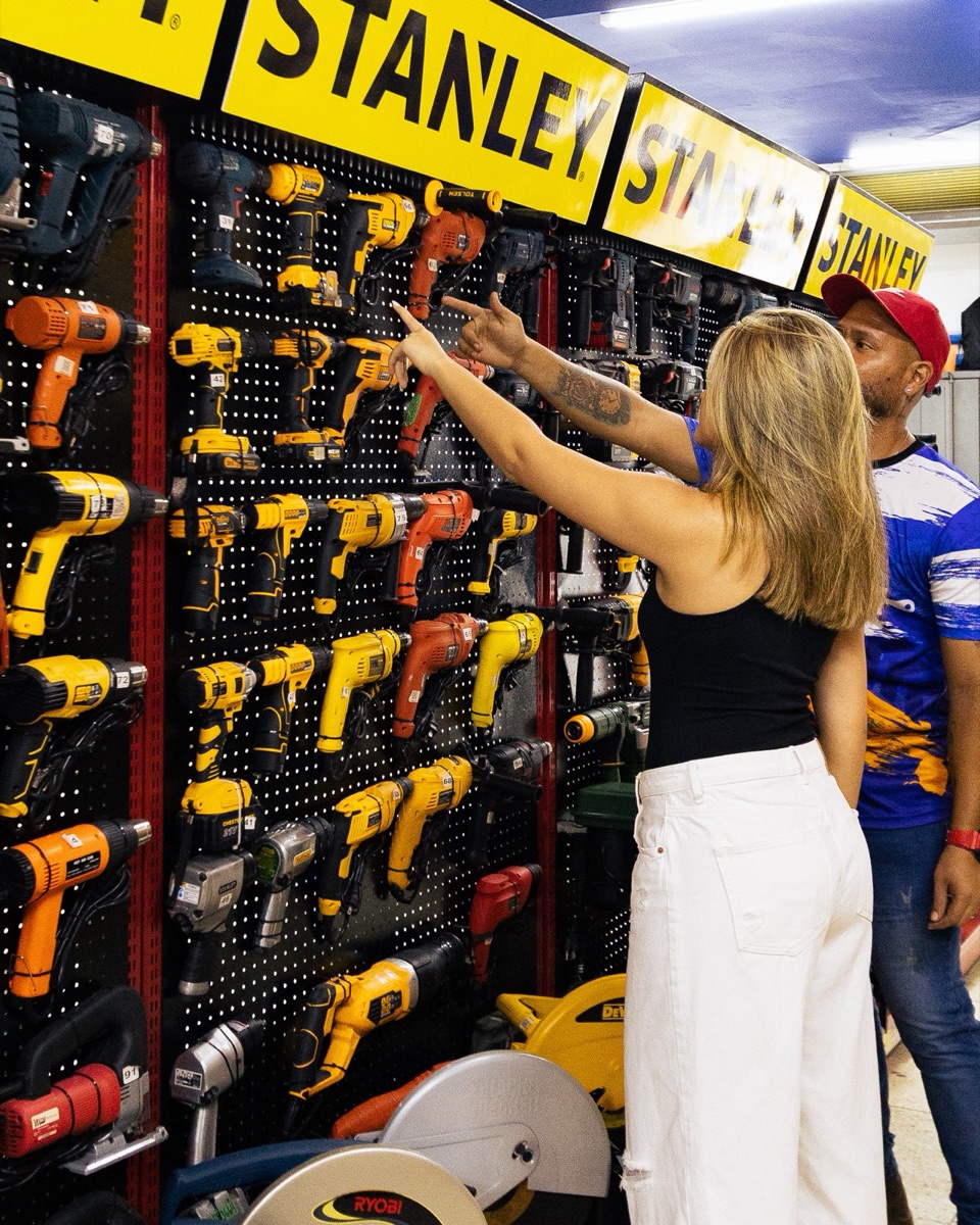
We run their Instagram, TikTok, YouTube and Facebook with in-store photography, real staff and the products of the brands they carry, and we push it with Meta Ads and YouTube Ads campaigns.
- TikTok
- YouTube
- Meta Ads
- YouTube Ads
 Stores
 Paint
 Tools
 Staff
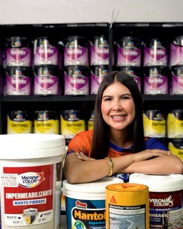
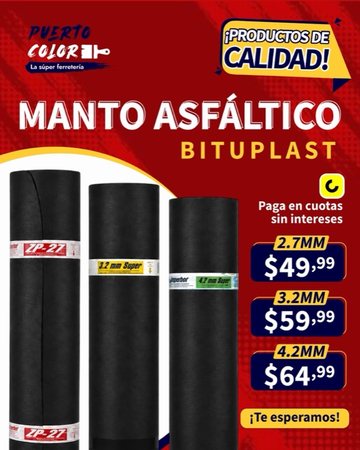
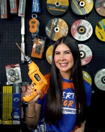
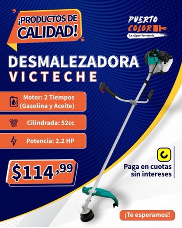
Todo para tu obra.
Learn more›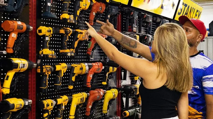 Ad · 0:05Skip ad
04 — Street and web
From billboard to website.
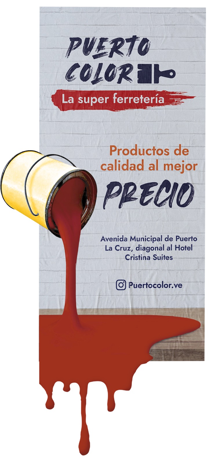
The same brand, big, on the city's billboards and on their website: the navy and orange people already know from the storefront.
Todo para tu obra.De la cabilla al último brochazo.
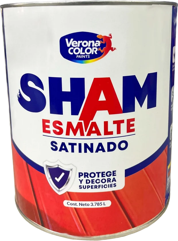
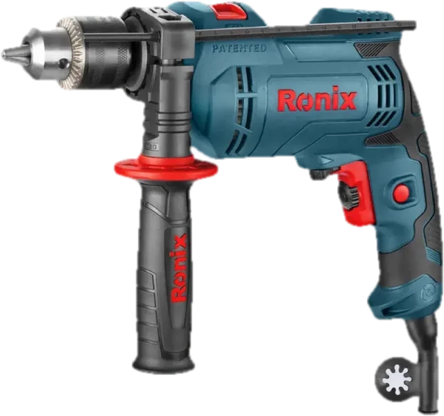
La súper ferretería de Oriente
Todo para tu obra,
en un solo lugar.
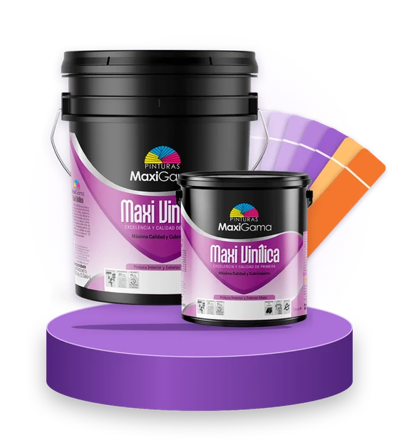
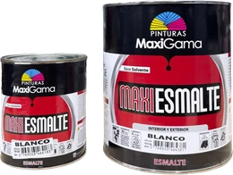 MaxiGamaMaxi EsmalteAgregar
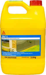 SikaSika-1Agregar
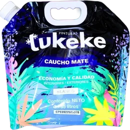 TukekePintura en bolsaAgregar
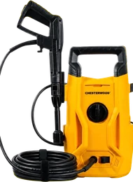 ChesterwoodHidrojetAgregar
The project
When we started working with Puerto Color, “La Súper Ferretería”, it had a single store. Today it has five and is recognized as the hardware leader in eastern Venezuela.
- Logo and brand strategy
- Instagram, TikTok, YouTube and Facebook
- Meta Ads
- YouTube Ads
- Billboards
- Website
- In-store photography

Shall we do the same for your brand?
Tell us about your business. We'll study your market and send you a tailored proposal.