
Manakü

Case study · Manakü

An açaí brand. Six letters.
Scroll
01 — Symbol
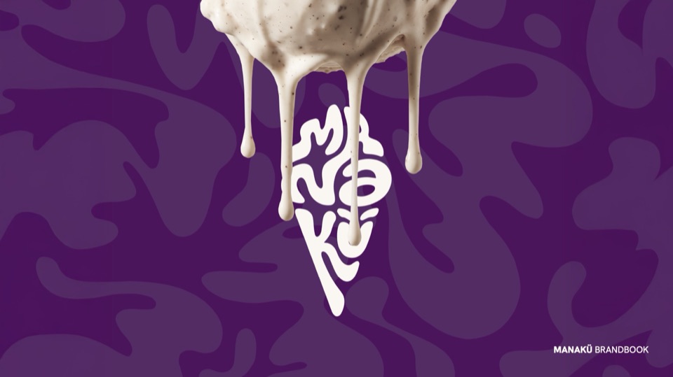
Six letters melting into a cone.
We created Manakü's full identity. The symbol is a cone built from the letters M-A-N-A-K-Ü and topped with melting ice cream, paired with a heavy wordmark.
02 — Pattern and color
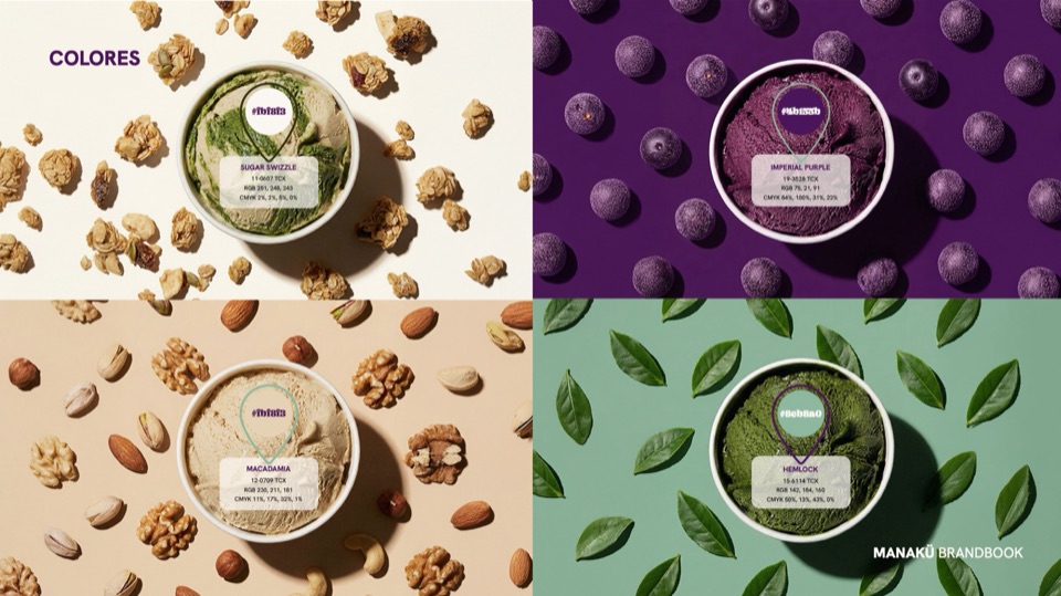
Its own pattern and a purple you won't forget.
Organic shapes for packaging and stationery, and a palette taken from the brand's flavors.
- Imperial Purple#4B155Baçaí
- Hemlock#8EB8A0leaves
- Macadamia#E6D3B5nuts
- Sugar Swizzle#FBF8F3granola
03 — Typography
Two type families.
The brand guidelines set a characterful primary typeface for headlines and a secondary one for text and stationery.
Primary typeface · 48 Point
Secondary typeface
Regular · Semibold · Bold
04 — Applications
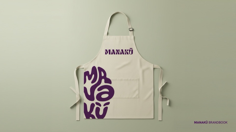
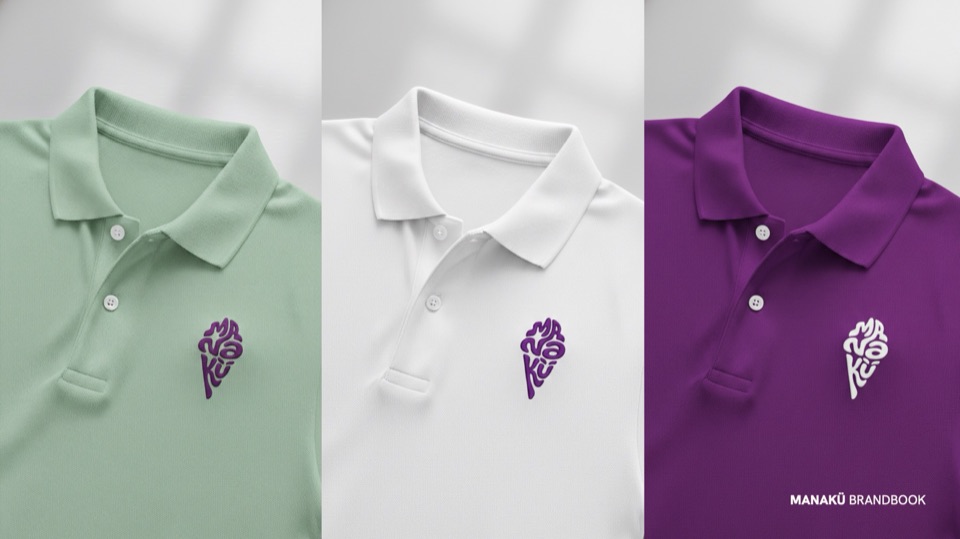
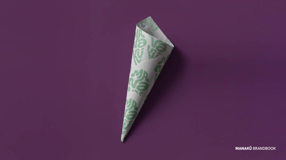
We built the brand. From cone to uniform.
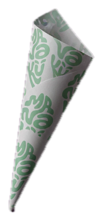
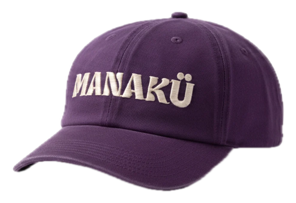
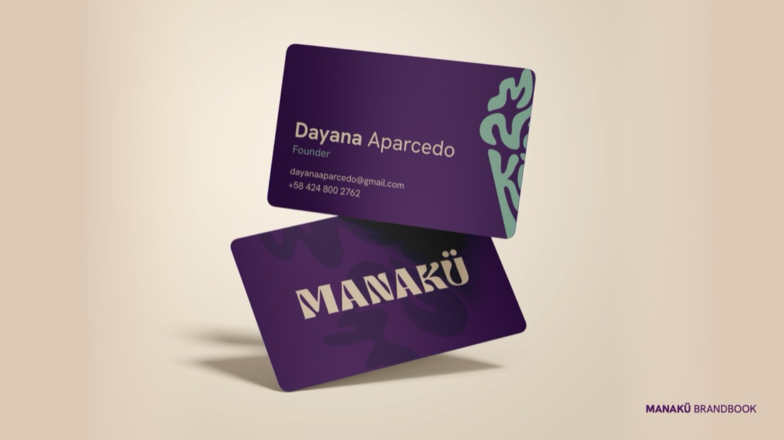
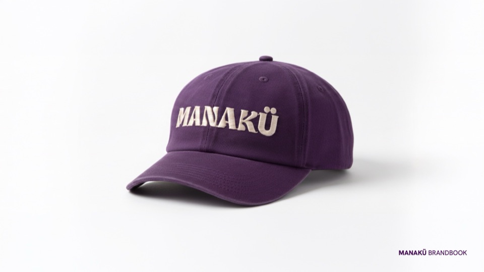
We carried the system to the cone wrapper, business cards, folders, letterhead, apron, cap and team polos.
The project
Manakü is an açaí brand we gave a complete identity. It starts from a cone-shaped mark built from the letters of the name and topped with melting ice cream, paired with a heavy wordmark.
- Logo and brand mark
- Brand guidelines
- Color and typography
- Brand pattern
- Ice cream wrapper
- Stationery and POS material
- Uniforms and merch

Shall we do the same for your brand?
Tell us about your business. We'll study your market and send you a tailored proposal.