
Panetteria Il Pomodoro
Panetteria Il Pomodoro · Puerto La Cruz
La dolce vita, turned into a brand.
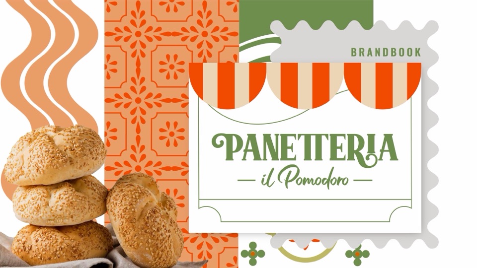
We created the identity of an Italian bakery, restaurant and market from scratch: a logotype that recalls classic Italian shop signs and a “P” symbol that signs every piece.
Concept
- Family
- Quality
- Freshness
Brand pattern
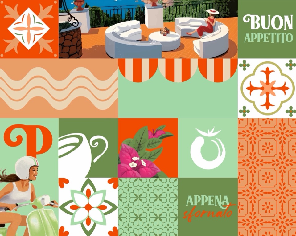
A mosaic laid tile by tile.
- TilesPainted tiles in orange, pistachio and olive.
- Waves and awningsThe awning stripes of an Italian street.
- Original illustrationsA seaside terrace, a girl on a Vespa and bougainvillea.
- Phrases“Buon appetito” and “Appena sfornato”.
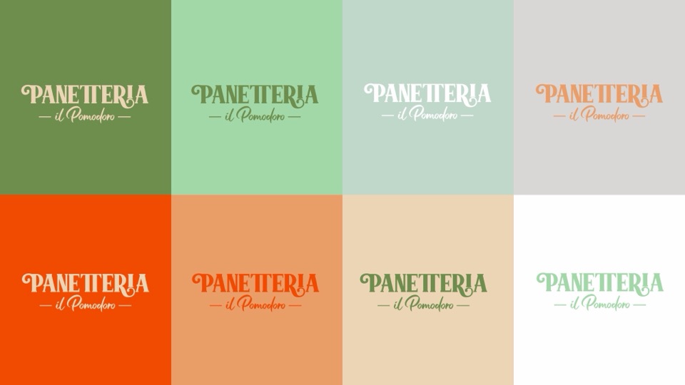
Color palette
Colors with Italian names.
Every shade in the palette has its own name: from Passione orange to Naturale green, by way of pistachio and the cream of fresh dough.

#F24A00
#6E8E4D
#A3D9A8
#C1D9CB
#EB9E68#EDD6B6
#D9D8D6

Typography
Three typefaces, one hierarchy.


Oswald
RegularSemiBoldBold

Packaging
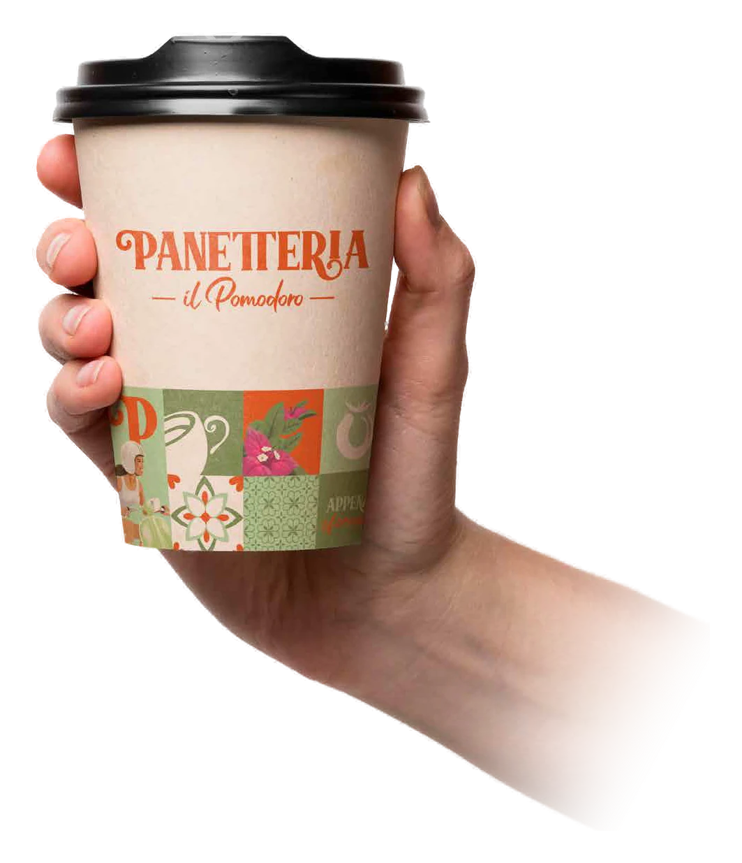
From the logo to the coffee cup.
The cup carries the logotype on the front and the mosaic around the base: the whole brand in every customer’s hand.
Applications
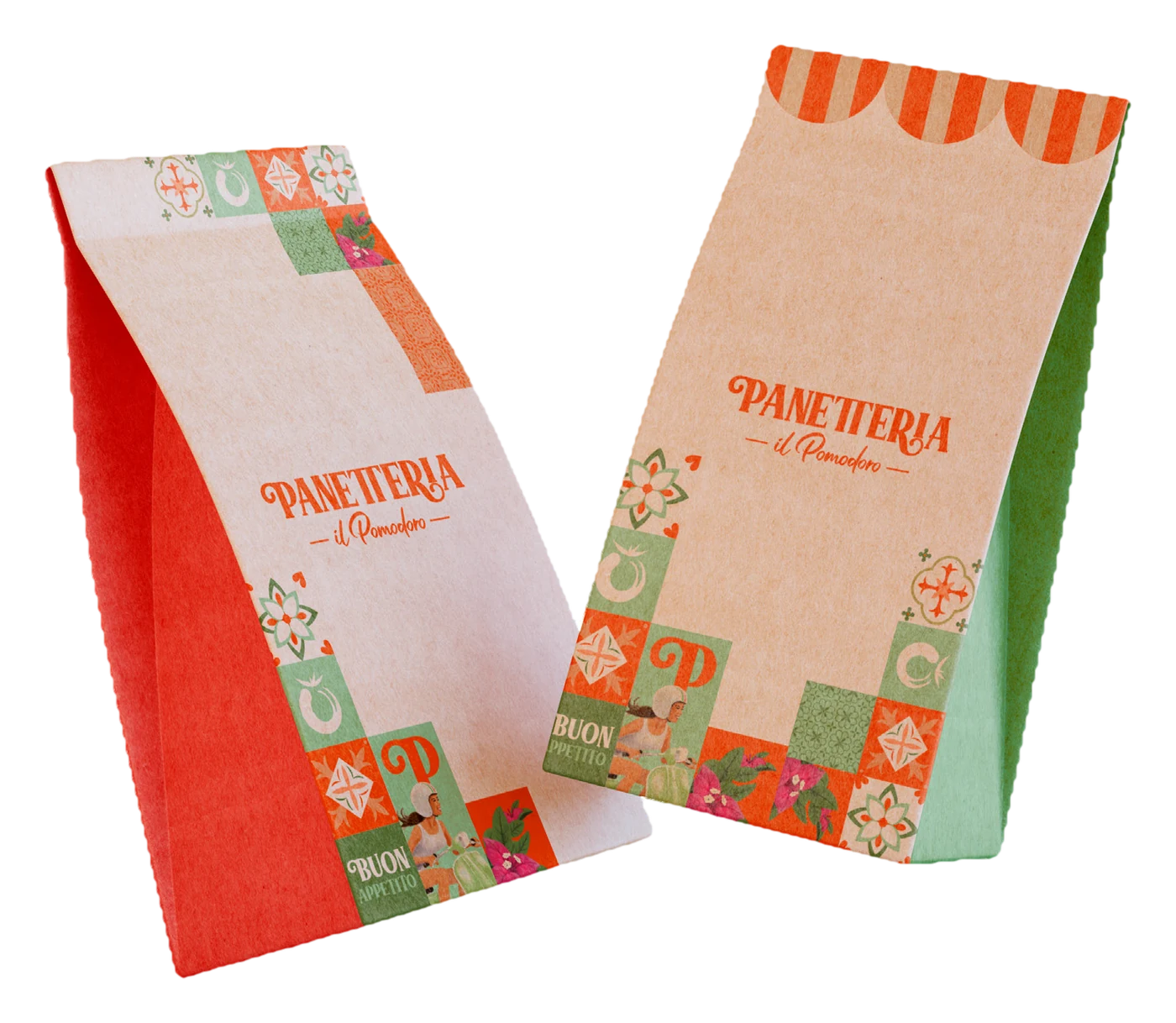
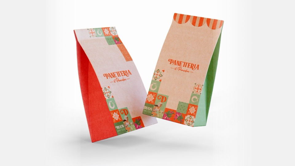
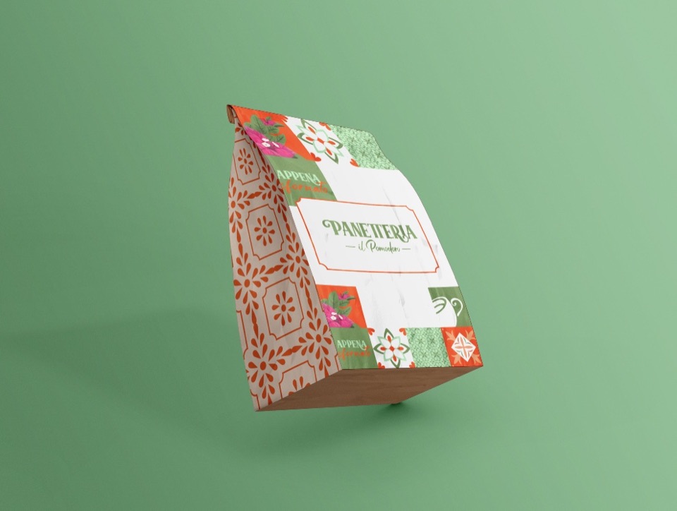
Bread bags with awnings and tiles.
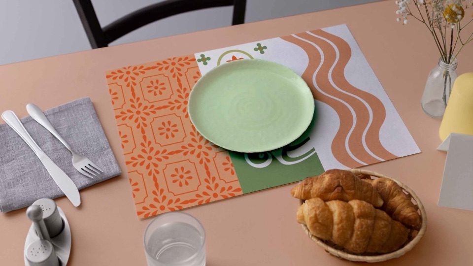
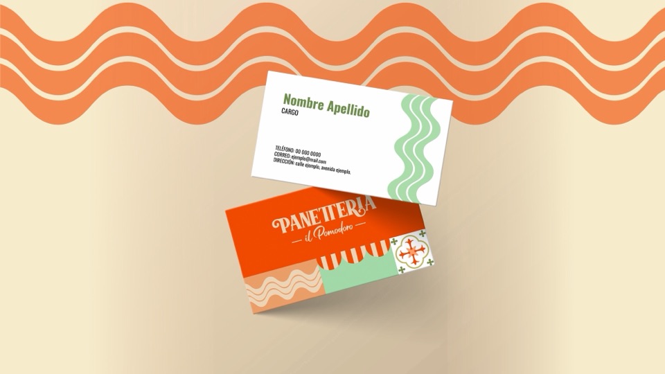
One bag wears the awning stripes, the other the mosaic. The same system reaches boxes, placemats, business cards, caps and uniforms, all set out in the brand book.
- Bread bags
- Boxes
- Coffee cups
- Placemats
- Business cards
- Caps
- Uniforms
- Brand book
The project
We created the identity of Panetteria Il Pomodoro, an Italian bakery, restaurant and market in Puerto La Cruz, from scratch. We started from three ideas, family, quality and freshness, and turned them into a logotype that recalls classic Italian shop signs, a “P” symbol and a palette where pistachio green sits alongside tomato orange, olive green and the cream of fresh dough.
- Brand creation
- Logotype and symbol
- Color palette and typography
- Brand pattern
- Illustrations
- Brand book
- Packaging and stationery
- Uniforms


Shall we do the same for your brand?
Tell us about your business. We'll study your market and send you a tailored proposal.