
Helados Dahab
Helados Dahab · Brand identity
An identity as intense as its flavors.
We created the identity of Helados Dahab, an ice cream shop born in Puerto Píritu: wordmark, palette, pattern, packaging and pieces.
Scroll
01 — Wordmark
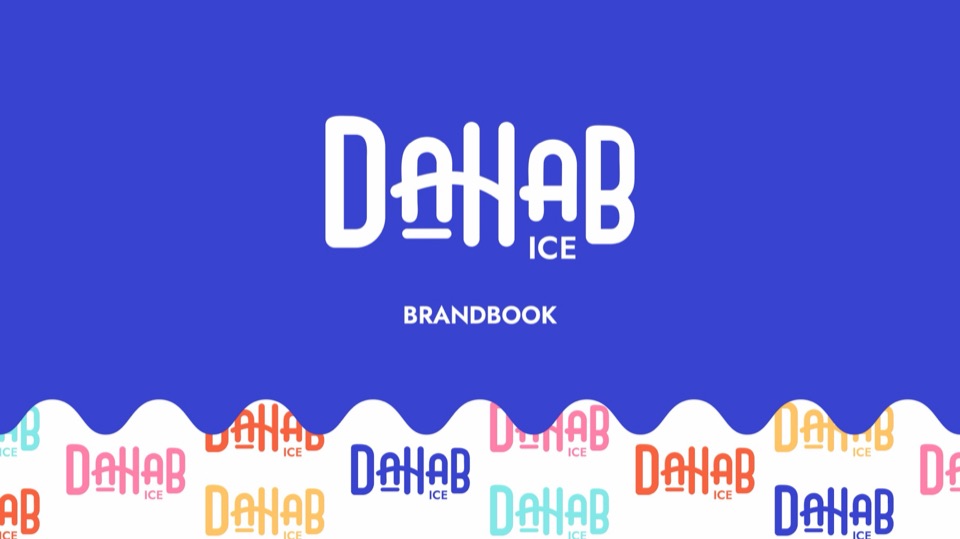
A condensed wordmark with rounded strokes.
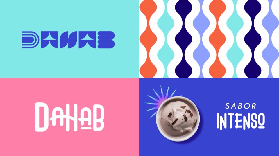
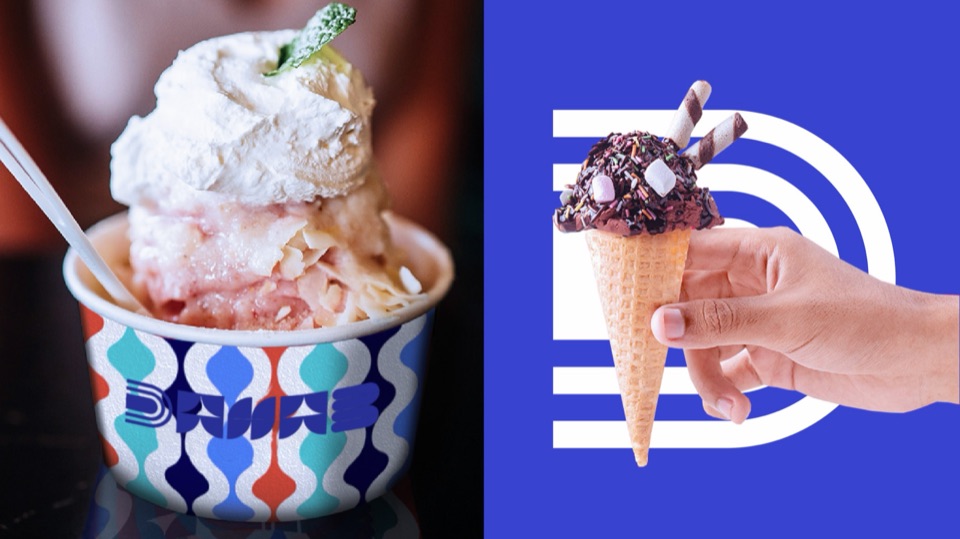
Alongside it, a three-stripe D that works as a symbol. Blue (Palatine Blue) is the lead color, with tomato, yellow, pink and aqua as accents.

01/07Palatine Blue#3843D0
02 — Typography
Claudio and Jost.
Claudio Regular · For headlines and key words.
Natural e intenso
Jost Regular, SemiBold and Bold · For long texts and headlines.
02/07Navy Blue#170073
03 — Promise
Saborintenso
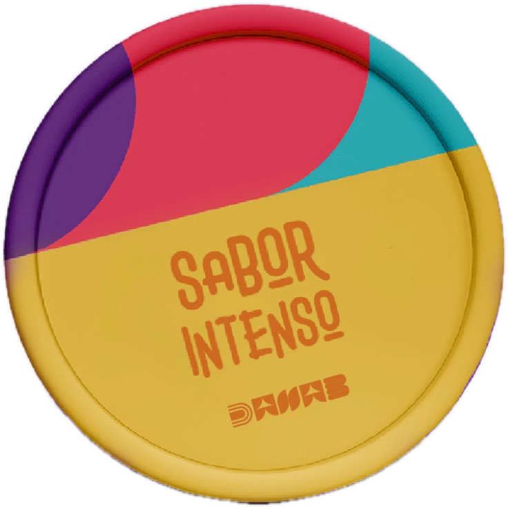
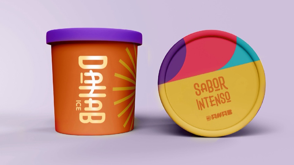
“Intense flavor”: the line that signs the tub lids and the brand’s pieces.
03/07Tomato#F8623F
04 — Pattern
Natural and intense.
A wave pattern for cups, tubs and social media, plus a set of graphic elements: bursts, stars and dots.
04/07Xanthous#FFC466
05 — Voice
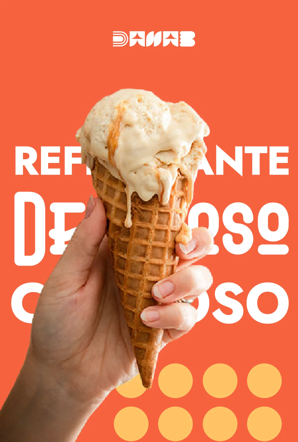
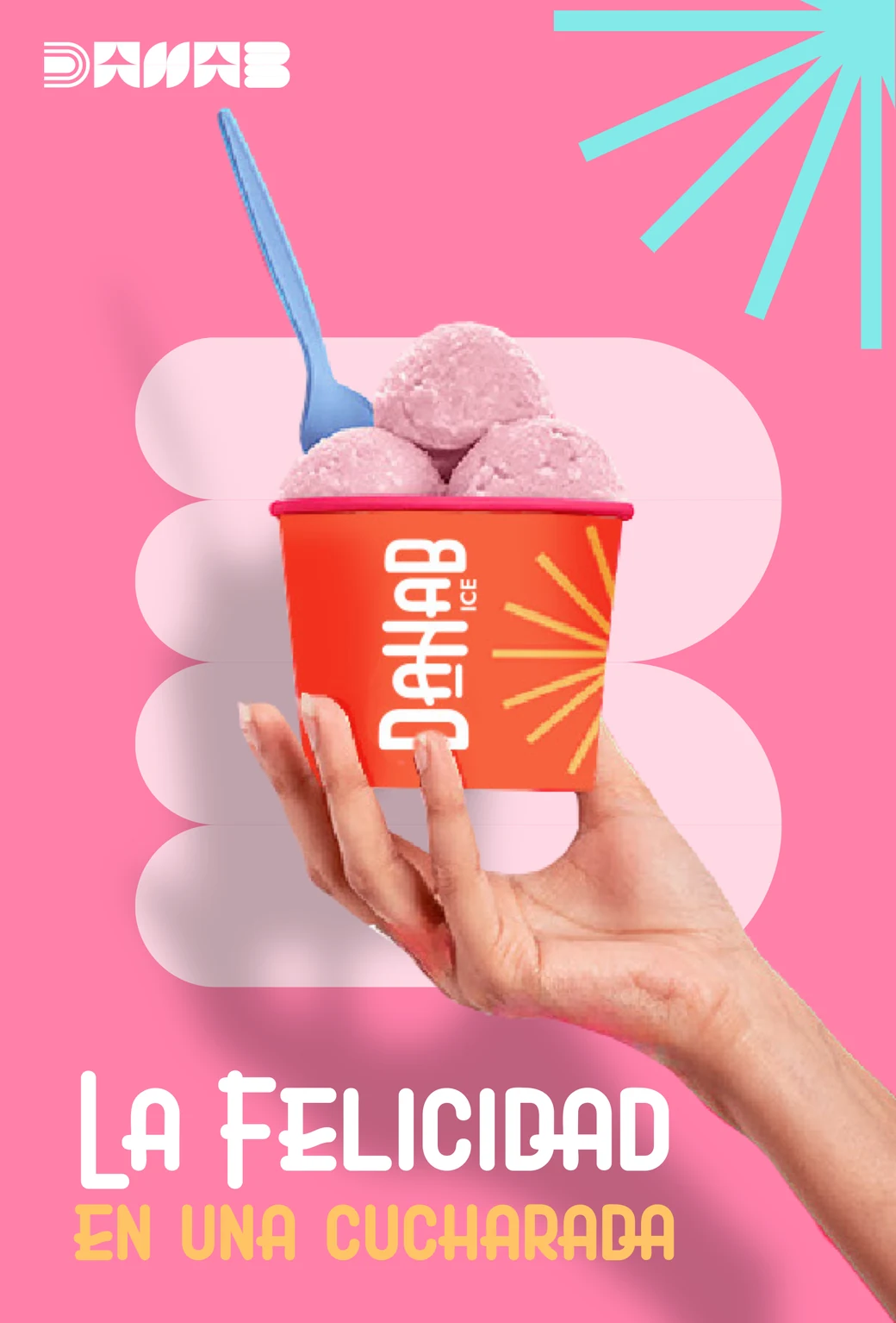
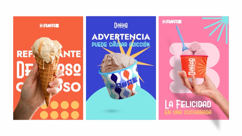
Happiness in a spoonful.
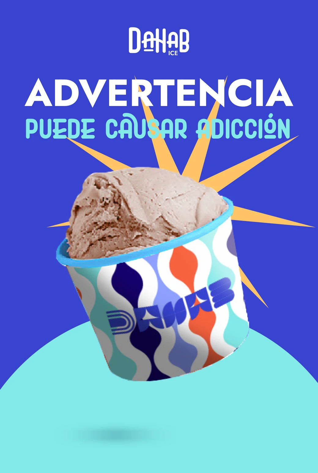
Posters carrying the brand’s lines, and a voice that warns: “may cause addiction.”
05/07Tickle Me Pink#FF80A9
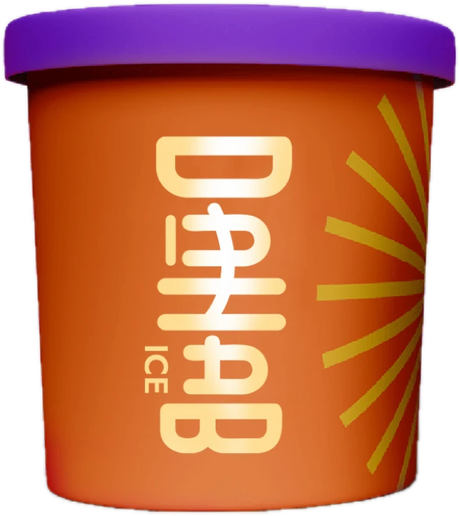
06 — Packaging
From logo to tub.
We applied the identity to:
- Cups
- Cones
- Tubs and lids
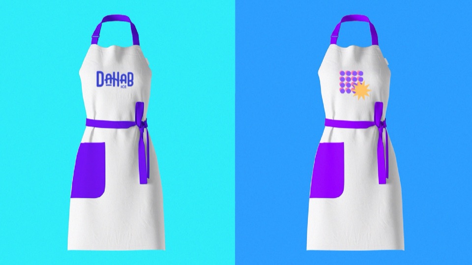
- Aprons
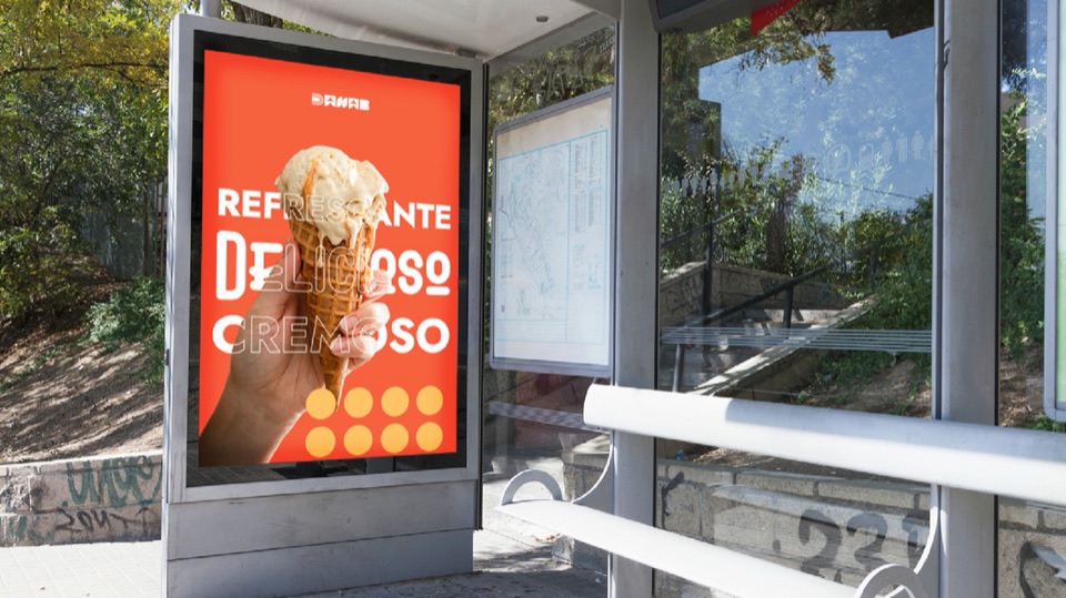
- Outdoor advertising
- Social media
06/07Electric Blue#83E9E8
07 — Growth
A brand ready to grow.
- Puerto PírituWhere it was born.
- Valle de la PascuaNow it serves there too.
- Retail and resaleIn-store sales and a network of entrepreneurs who resell its ice cream.
- FranchiseIts first steps as a franchise.
07/07Medium Slate Blue#8E59FF
The project
Helados Dahab was born in Puerto Píritu and now also serves Valle de la Pascua, selling in store and through a network of entrepreneurs who resell its ice cream, and it's taking its first steps as a franchise. We built its identity on a condensed, rounded wordmark, a deep blue as the lead color and an accent palette (tomato, yellow, pink and aqua) that reads as ice cream from across the street.
- Logo and variations
- Brand guidelines
- Color and typography
- Pattern and graphic elements
- Tubs and cups
- Social media pieces
- Uniforms and outdoor advertising

Shall we do the same for your brand?
Tell us about your business. We'll study your market and send you a tailored proposal.